



My name is Ghulam Mohiudeen and I am a website developer. In today’s tutorial, I am going to tell you how to create a mesher background without any plugin. Mesher background is also very popular in Figma. But creating it in Elements can be a bit complicated, but it is not like that.
Today, I am going to tell you a very easy method. I am going to share it with you. You can add it not only to the hero section of your website, but to any section, anywhere. You just have to follow the simple steps.
So if you follow along in the video, I refer to this blog post for you to either enter code at certain points into the Custom CSS option inside the main container, so below is everything you will need!
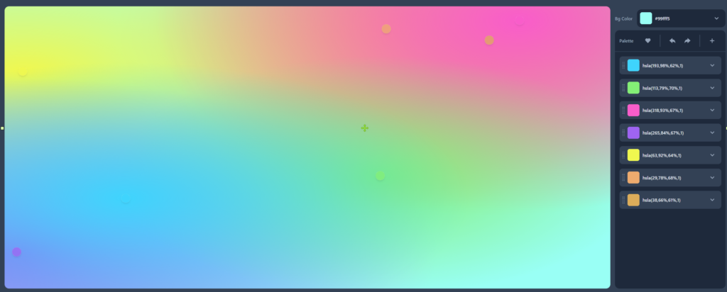
To create the code for your own mesh design, click this button below to go to CSSHero
The css code used in the Main Container that houses the Custom CSS animation.
This is the animation code, put it into the Custom CSS tab under Advanced Settings of the main container. remember to give a custom css class to the container you are using this code in.
.animated-mesh-gradient-background{

    /* place your gradient code in this spot here*/

    animation: animatedgradient 10s ease infinite;
    background-size: 200% 200%;
}

@keyframes animatedgradient {
    0% {
        background-position: 0% 25%;
    }
    25% {
        background-position: 100% 50%;
    }
    50% {
        background-position: 50% 75%;
    }
    75% {
        background-position: 25% 25%;
    }
    100% {
        background-position: 0% 25%;
    }
}
This is the example I used exactly in the video, put it into the Custom CSS tab under Advanced Settings of the main container, remember to give a custom css class to the container you are using this code in.
.animated-background{

    background-color:hsla(237,67%,8%,1);
background-image:
radial-gradient(at 80% 100%, hsla(221,83%,53%,1) 0px, transparent 50%),
radial-gradient(at 0% 0%, hsla(217,91%,59%,1) 0px, transparent 50%);

    animation: animatedgradient 10s ease infinite;
    background-size: 200% 200%;
}

@keyframes animatedgradient {
    0% {
        background-position: 0% 25%;
    }
    25% {
        background-position: 100% 50%;
    }
    50% {
        background-position: 50% 75%;
    }
    75% {
        background-position: 25% 25%;
    }
    100% {
        background-position: 0% 25%;
    }
}
If you want to further enhance your mesh background, you can add this texture background. You have to go to Elementor, go to Background Overlay, select the texture, and then adjust its opacity as per your needs. You can also add CSS filters.
Everything that is mentioned in the video has been put into a zip file that includes everything.