Making websites that look good on all devices can be overwhelming. You may be wondering which dimensions to employ? What can I do to ensure that it is compatible with phones and desktops? The fact is that there’s no “perfect” size-but there are tested strategies for creating web pages that are able to adapt for any display. This guide will guide through everything you should know, from regular screen resolutions to responsive design methods by using a simple language as well as practical examples.
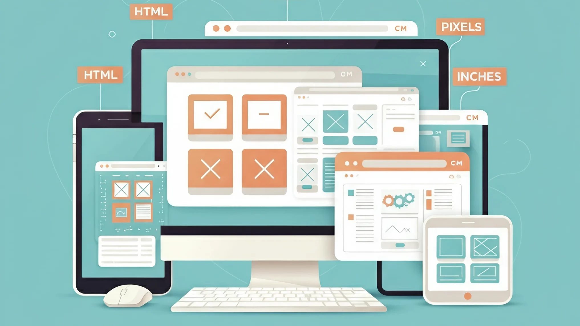
Understanding Screen Sizes and Resolutions
Why Screen Size Matters
Imagine visiting a website with your phone only to discover tiny text and buttons that you aren’t able to click. Frustrating, right? The size of the screen directly affects user experience. If your designs don’t match the screen size of the device being used, users will likely to quit quickly.
Common Screen Resolutions in 2025
- Desktop: 1280×720 to 1920×1080 (most popular: 1440×900).
- Mobile: 360×800 to 414×896.
- Tablet: 768×1024 to 1280×800.
These categories cover the majority of phones however, newer smartphones and monitors are breaking new ground. For instance, 4K displays (3840×2160) are gaining popularity but just 8% people currently have them.
Fixed Vs. Fluid Layouts: Which One is Better?
The Case for Fixed-Width Designs
Layouts with fixed width (e.g. and the 960px) were the norm in the past. The most popular websites such as Facebook and YouTube utilized them since they appeared consistent on 1024×768 screen sizes. But, with the size of screens changing fixed designs usually result in awkward spaces for larger displays.
The Rise of Fluid and Responsive Designs
Fluid layouts employ proportions, instead of pixels fixed in size which allows the content to stretch and shrink. Together together with adaptive web design (RWD) This technique ensures your website adapts with any gadget. Google recommends RWD as it boosts SEO and lowers bounce rates.
Responsive Web Design: The Modern Solution

How Responsive Design Works
Responsive websites rely on three fundamental elements:
- Flexible Grids Resize elements proportionally (e.g. for example, the 50% width column stays at half of the screen regardless of whether it’s 800px or 400px).
- Media Queries: CSS rules that cause layout changes at certain breaks (e.g. changing fonts for screens with less than 768 pixels).
- images that can be scaled images that can be scaled without sacrificing quality, usually made using SVGs or
maximum-width rule 100 100%CSS rules.
Example Breakpoints for 2025
| Device | Breakpoint Range |
|---|---|
| Mobile (Small) | 320px – 480px |
| Mobile (Large) | 481px – 768px |
| Tablet | 769px – 1024px |
| Desktop | 1025px+ |
The ranges of these ensure that your design appears refined on everything from old iPhones to 4K-quality monitors.
Mobile-First Design: Start Small, Scale Up
Why Mobile-First?
More than 60% of all website traffic comes from mobile devices. The design of smaller screens first requires you to prioritize the most important content which leads to more efficient layouts.
Personal Experience Client once demanded a design that was only available on desktops. Their bounce rate increased up to 70% due the fact that mobile users were unable to navigate through the menu. When they switched to a mobile-first approach, conversion rates were up by 40% over three months.
Practical Tips for Mobile Design
- Use large, tappable button (minimum 48×48 pixels).
- Simple menus can be simplified by turning them into icons for hamburgers.
- Convert images to minimize loading times (aim to keep the file size under 200KB for each image).
Image and Asset Optimization
Ideal Image Sizes for the Web
- Hero images Resolution: 1920×1080 inches (compressed up to 150-300KB).
- Thumbnails 400×400 pixels (under 50KB).
- Backgrounds Use CSS gradients and SVGs to reduce the size of files.
Tips for Pros Tools such as Squoosh or TinyPNG minimize file size without any loss of quality.
Tools and Best Practices
Design Software Recommendations
- Figma The first step is to start with a 1440×900 artboard on desktops, and 360×800 on mobile devices.
- Adobe XD: The grids are pre-built and responsive, which makes scaling easier.
Common Mistakes to Avoid
- Unconscious Fold Content Put important information (e.g. CTAs) in the initial 600 pixels to prevent excessive scrolling.
- Missing Touch Targets Too many buttons close? Mobile users will have a difficult time to tap the right way.
- Fixed-Position Element They can also be used to overlap content on smaller screens.
The Future of Web Design
With smartphones that fold and AR glasses hitting the market, designers need to prepare for screens that are not conventional. Techniques such as containers queries (CSS functions that adjust components, not only complete pages) will be essential.
Final Thoughts
The process of designing a website isn’t just about choosing a “perfect” size-it’s about creating an adaptable system that can work across all devices. Start with mobile devices, then employ methods that are responsive, and then try it on actual devices. Remember, the objective of your site is to create a website friendly for all users, regardless of whether they’re using a 10-year-old laptop or the newest Galaxy Fold.
Following these rules You’ll create sites that are not just visually pleasing, but also practical and future-proof. Happy designing!
Citations offer the insights of industry reports as well as real-world cases. For deeper dives, explore tools like Google Analytics’ Device Overview or A/B test different layouts.

